KPI Line Chart with Gradient Shadow in Power BI
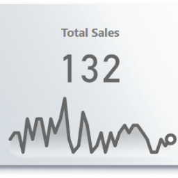
Data visualization is key to making insights clear and actionable—and a KPI Line Chart with Gradient Shadow is a visually compelling way to track performance over time. Whether you’re monitoring sales trends, website traffic, or operational metrics, this custom visual enhances readability while adding a modern aesthetic.
Why Use This Chart?
1. Enhanced Visual Appeal
- The gradient shadow effect makes the line chart stand out, drawing attention to trends.
- Soft color transitions improve readability compared to flat, solid lines.
2. Better Trend Recognition
- The subtle shadow beneath the line creates depth, making it easier to follow fluctuations.
- Works well in card visuals, allowing you to highlight KPIs alongside trend analysis.
3. Professional & Modern Look
- Ideal for executive dashboards where sleek design matters.
- Makes reports more engaging without sacrificing functionality.
How to Use It in a Card Visual
You can combine this KPI line chart with a Card visual to display: ✔ Current Value (e.g., “Total Sales: $250K”) ✔ Trend Indicator (up/down arrows) ✔ Mini Trend Line (with gradient shadow for visual impact) This creates a compact yet powerful way to show both the metric and its historical performance.
Pros & Cons
✔ Pros:
- More engaging than standard line charts.
- Improves dashboard aesthetics without clutter.
- Works well in small spaces (like cards or tooltips).
❌ Cons:
- May not be ideal for ultra-detailed analysis (stick to traditional line charts for complex data).
- Requires some customization (gradient effects need proper setup).
Final Thoughts
If you want to make your KPIs visually striking while keeping them functional, a gradient-shadow line chart is a great choice—especially when paired with card visuals. It’s perfect for dashboards where both design and data clarity matter. Have you tried this in your reports? Let me know how it works for you! 🚀
Use this DAX measure (customize thresholds/colors as needed):
Line Chart with Gradient Shadow (New Card) =
// Static line color - use %23 instead of # for Firefox compatibility
VAR LineColor = "%23666666"
VAR PointColor = "white"
VAR Defs = "<defs>
    <linearGradient id='grad' x1='0' y1='25' x2='0' y2='50' gradientUnits='userSpaceOnUse'>
        <stop stop-color='#666666' offset='0' />
        <stop stop-color='#666666' offset='0.3' />
        <stop stop-color='white' offset='1' />
    </linearGradient>
</defs>"
// "Date" field used in this example along the X axis
VAR XMinDate = MIN('Calendar Table'[Month Start])
VAR XMaxDate = MAX('Calendar Table'[Month Start])

// Obtain overall min and overall max measure values when evaluated for each date
VAR YMinValue = MINX(Values('Calendar Table'[Month Start]),CALCULATE([Total Sales]))
VAR YMaxValue = MAXX(Values('Calendar Table'[Month Start]),CALCULATE([Total Sales]))

// Build table of X & Y coordinates and fit to 50 x 150 viewbox
VAR SparklineTable = ADDCOLUMNS(
    SUMMARIZE('Calendar Table','Calendar Table'[Month Start]),
        "X",INT(150 * DIVIDE('Calendar Table'[Month Start]- XMinDate, XMaxDate - XMinDate)),
        "Y",INT(50 * DIVIDE([Total Sales] - YMinValue,YMaxValue - YMinValue)))

// Concatenate X & Y coordinates to build the sparkline
VAR Lines = CONCATENATEX(SparklineTable,[X] & "," & 50-[Y]," ",'Calendar Table'[Month Start])

// Last data points on the line
VAR LastSparkYValue = MAXX( FILTER(SparklineTable, 'Calendar Table'[Month Start] = XMaxDate), [Y])
VAR LastSparkXValue = MAXX( FILTER(SparklineTable, 'Calendar Table'[Month Start] = XMaxDate), [X])

// Add to SVG, and verify Data Category is set to Image URL for this measure
VAR SVGImageURL =
    "data:image/svg+xml;utf8," &
    --- gradient---
    "<svg xmlns='http://www.w3.org/2000/svg' x='0px' y='0px' viewBox='-7 -7 164 64'>" & Defs &
     "<polyline fill='url(#grad)' fill-opacity='0.3' stroke='transparent'
      stroke-width='0' points=' 0 50 " & Lines &
      " 150 150 Z '/>" &
    --- Lines---
    "<polyline
        fill='transparent' stroke='" & LineColour & "'
        stroke-linecap='round' stroke-linejoin='round'
        stroke-width='3' points=' " & Lines &
      " '/>" &
    --- Last Point---
        "<circle cx='"& LastSparkXValue & "' cy='" & 50 - LastSparkYValue & "' r='4' stroke='" & LineColour & "' stroke-width='3' fill='" & PointColour & "' />" &
        "</svg>"
RETURN SVGImageURL


