Use Case: Service Desk IT Performance Dashboard
Goal
A company outsourced my client to maintain their IT systems and handle all incoming support tickets. The leadership team needed a clear, transparent way to show the outsourcing partner their workload, efficiency, and the value they provide. The dashboard had to justify the investment, demonstrate service quality, and present results in a simple, visual format that non-technical stakeholders could understand.
Challenge
The outsourced team managed a large volume of tickets across different systems, but reporting was scattered and mostly manual. There was no unified view of performance: ticket volume, SLA compliance, priority trends, recurring issues, and agent workload were difficult to track. Without a centralized reporting tool, it was hard to prove efficiency or communicate operational value to the company that hired them.
Solution
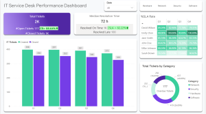
I created a Power BI dashboard that consolidated all service desk data into a single, easy-to-understand performance report.
The dashboard shows:
-
Ticket volume trends
-
SLA compliance and resolution speed
-
Agent workload and efficiency
-
Recurring issues and system hotspots
-
Backlog and priority distribution
Power BI was the fastest and most effective way to present these results visually and transparently. Automated refresh ensured accurate, real-time reporting without manual effort.
Result
The dashboard became the core tool used in conversations with the outsourcing partner. It clearly demonstrated workload, efficiency, and operational value, helping justify the investment in the outsourced team. Managers gained full visibility into service performance, productivity increased, and reporting time dropped dramatically.
This dashboard turned complex service operations into a clean, visual story that strengthened trust between the two companies.