Animated Donut Chart
The Secret Weapon for Memorable Dashboards: Animated Donut Charts Explained
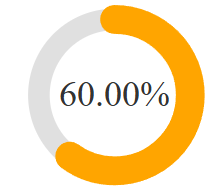
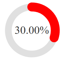
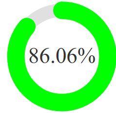
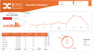
Animated donut charts are a visually engaging way to display progress metrics, KPIs, or completion rates in Power BI. Unlike static charts, they capture attention with smooth animations and dynamic color changes based on performance thresholds.
1. When to Use Animated Donut Charts
Best for:
- KPI Tracking (e.g., compliance rates, project completion)
- Goal-Based Metrics (e.g., sales targets, customer satisfaction)
- Interactive Dashboards (where visual appeal matters)
- Executive Reports (clean, at-a-glance progress visualization)
Avoid when:
- You need detailed multi-category comparisons (use bar/column charts instead).
- The data updates too frequently (animation may become distracting).
2. Benefits of Animated Donut Charts
a. Visual Impact
- Smooth animations draw attention to key metrics.
- Color transitions (red → amber → green) instantly communicate performance.
b. Improved User Engagement
- More memorable than static charts.
- Encourages users to interact with the report.
c. Space Efficiency
- Fits well in compact dashboards while displaying % completion clearly.
d. Professional Polish
- Shows advanced Power BI skills (DAX, SVG, conditional formatting).
- Great for portfolio projects to demonstrate creativity.
3. How to Make Your Donut Chart Stand Out
Customization Tips
Change colors to match corporate branding.
Adjust size for mobile-friendly dashboards.
Add dynamic labels (e.g., “On Track” vs. “Needs Improvement”).
Advanced Tweaks
Add tooltips for detailed breakdowns.
Sync with slicers for interactive filtering.
4. Why This Belongs in Your Power BI Portfolio
Showcases Technical Skills
- DAX formulas for dynamic SVG generation.
- Conditional formatting with color thresholds.
- Creative problem-solving beyond default visuals.
Demonstrates UX Awareness
- Proves you prioritize user engagement and clarity.
Real-World Applicability
- Used in sales, operations, and executive reporting.
Final Thoughts
Animated donut charts are a simple yet powerful way to make your Power BI reports more engaging. They’re perfect for:
- Goal tracking
- Executive summaries
- Portfolio projects
Try adding one to your next dashboard—your users (and hiring managers) will notice the difference!
How to Implement It
Use this DAX measure (customize thresholds/colors as needed):
Animated Donut Chart =
VAR ProgressValue = [SLA Compliance Rate%]* 100  // Current progress (0-100)
VAR Radius = 42  // Radius of the donut chart
VAR CircumferenceValue = 2 * PI() * Radius  // Full circumference of the circle
VAR ProgressLength = (ProgressValue / 100) * CircumferenceValue  // Length of the progress stroke
VAR CenterX = 60 // X-coordinate of the center
VAR CenterY = 60  // Y-coordinate of the center
VAR BackgroundStrokeWidth = 12  // Width of the background ring
VAR ProgressStrokeWidth = 16  // Width of the progress ring

// --- COLOR DEFINITIONS ---
VAR RedColor = "#FF0000"  // Red color for low values (<50%)
VAR AmberColor = "#FFA500"  // Amber color for medium values (50-80%)
VAR GreenColor = "#00FF00"  // Green color for high values (>=80%)

// --- TARGET THRESHOLDS ---
// Determines the final color based on ProgressValue:
// - Below 50% → Red
// - 50-80% → Amber
// - 80%+ → Green
VAR FinalColor =
    SWITCH(
        TRUE(),
        ProgressValue < 50, RedColor,  // Target: <50% → Red
        ProgressValue < 80, AmberColor,  // Target: 50-80% → Amber
        GreenColor  // Target: >=80% → Green
    )

RETURN
"data:image/svg+xml;utf8,<svg xmlns='http://www.w3.org/2000/svg' viewBox='0 0 120 120' width='260' height='260'>
  <style>
    @keyframes progress-fill {
      0% { stroke-dashoffset: " & CircumferenceValue & "; stroke: " & RedColor & "; }
      50% { stroke-dashoffset: " & (CircumferenceValue - (CircumferenceValue * 0.5)) & "; stroke: " & AmberColor & "; }
      80% { stroke-dashoffset: " & (CircumferenceValue - (CircumferenceValue * 0.8)) & "; stroke: " & AmberColor & "; }
      100% { stroke-dashoffset: " & (CircumferenceValue - ProgressLength) & "; stroke: " & FinalColor & "; }  // Final color depends on ProgressValue
    }
    .progress-ring {
      animation: progress-fill 2s ease-out forwards;
    }
  </style>
  <circle cx='" & CenterX & "' cy='" & CenterY & "' r='" & Radius & "' fill='none' stroke='#E0E0E0' stroke-width='" & BackgroundStrokeWidth & "'/>
  <circle class='progress-ring' cx='" & CenterX & "' cy='" & CenterY & "' r='" & Radius & "' fill='none' stroke='" & RedColor & "' stroke-width='" & ProgressStrokeWidth & "'
          stroke-dasharray='" & CircumferenceValue & "' stroke-dashoffset='" & CircumferenceValue & "'
          transform='rotate(-90 " & CenterX & " " & CenterY & ")' stroke-linecap='round'/>
  <text x='" & CenterX & "' y='" & CenterY & "' text-anchor='middle' dy='.3em' font-size='20' fill='#333'>" & FORMAT(ProgressValue / 100, "0.00%") & "</text>
</svg>"
Here is full video tutorial:


