HeatMap Visualization in Power BI

Unlock Hidden Insights with Power BI Heat Maps (Using Matrix Visuals!)
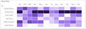
Heat maps turn complex data into colorful, intuitive stories, revealing patterns and outliers at a glance. In Power BI, you can create a powerful heat map in seconds using the matrix visualization—no coding or custom visuals needed.
Why Matrix Heat Maps Win
- Simple & Native: Just drag fields into a matrix, apply conditional formatting, and watch your data transform into a gradient-powered insight engine.
- Instant Clarity: Spot highs, lows, and trends faster than scanning rows of numbers.
- Seamless Integration: Works flawlessly with filters, tooltips, and other Power BI features.
When to Use Them
✔ Sales & Performance Tracking (e.g., revenue by region × month)
✔ Correlation Analysis (e.g., customer satisfaction across departments)
✔ Resource Allocation (e.g., inventory or workload hotspots)
✔ Time-Based Trends (e.g., monthly website traffic)
Watch Out For…
- Colorblindness: Use accessible palettes (like blue-orange) and add labels.
- Overcrowding: Best for moderate-sized datasets—too many rows/columns = messy.
- Precision Trade-off: Colors highlight trends, not exact values. Use tooltips for details.
Pro Tips
🎨 Pick intuitive colors (e.g., red = high, blue = low).
🔍 Add slicers to let users drill into specifics.
📌 Pair with a table if exact numbers are critical.
Final Verdict
Matrix heat maps are a quick, effective way to visualize dense data—perfect for dashboards and stakeholder reports. Just keep your dataset clean and your colors clear!
Ready to try it? Watch the video below to learn how to create a stunning heat map that will impress your users in minutes! 👇


Leave a Reply