


Blog
-
Calculated Columns vs Measures in Power BI
Complete Guide to Calculated Columns vs Measures in Power BI When working with DAX in Power BI, you’ll often encounter two key components: calculated columns and measures. These are fundamental concepts for building calculations in Power BI. However, it’s essential to understand…
-
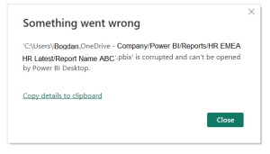
“Something Went Wrong” or “Unable to Open Document” 3 Lifesaving Recovery Tricks
Power BI Report Crashed? Try These 3 Lifesaving Recovery Tricks Have you ever been deep into building a Power BI report—adding visuals, writing DAX, aligning everything just right—when suddenly your system crashes or your laptop decides it’s time for an unexpected restart?…
-
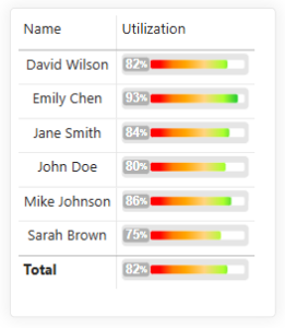
Animated RAG Bar Chart
Animated RAG Bar Chart in Power BI: A Dynamic Visual for Performance Insights One of the most fundamental chart types in data visualization is the bar chart—a powerful and flexible tool that helps us explore and understand data at a glance. Whether…
-
Automated Power BI Data Snapshots: Capture Historical Trends with Power Automate
Automated Power BI Data Snapshots: Capture Historical Trends with Power Automate Have you ever needed to analyze trends, but your data source only provides current data—with no historical records? That was exactly the challenge I faced until I built a simple yet…
-
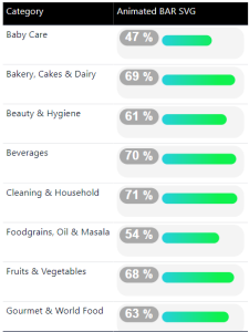
Animated Bar Chart
Animated Bar Chart If you’re tired of standard visuals and want to add serious flair to your Power BI dashboards, it’s time to bring in animated bar charts using SVG and DAX. These visuals aren’t just pretty—they’re functional, dynamic, and portfolio-worthy. Whether…