How Business Analysts Actually Use Power BI in Real Projects

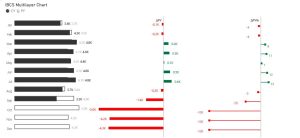
Most people look at Power BI and immediately think of dashboards.
A set of charts, some filters, maybe a few KPIs at the top. Something that summarizes what is happening in the business.
And that is true, but only on the surface.
In real projects, Power BI is rarely just a reporting tool. For a Business Analyst, and for anyone building analytics solutions, it behaves much more like a decision making tool. A place where problems become visible, and decisions slowly start to take shape.
This way of working is very close to what the BABOK Guide describes as business analysis in its broader sense: understanding needs, defining problems clearly, and enabling change that actually delivers value.
And that “value” rarely comes from a dashboard alone. It comes from decisions that are better informed than before.
In most real projects, things do not start in a structured way.
A stakeholder usually comes with a simple statement. Something like “sales are dropping” or “we need better visibility” or “we need a dashboard for performance”.
On the surface, these sound like clear requests. But if you take them too literally, you often end up building something that looks complete, yet does not really help anyone make decisions.
A more useful way to start is to slow the conversation down a bit and stay closer to the problem than the solution.
Instead of immediately thinking about visuals or tables, the focus shifts to understanding what is actually happening in the business. Where things feel uncertain. Where decisions are being made based on intuition instead of evidence. Where people feel something is wrong but cannot clearly explain why.
When someone says “sales are dropping,” that statement is usually just the beginning of the story, not the full picture.
As soon as you start looking at the data in Power BI, even in a very simple way, the story often becomes more detailed. The drop might not be everywhere. It might be concentrated in one region, or tied to a specific product line, or connected to a certain time period.
This is usually the first moment where the role of Power BI changes. It stops being about reporting what is known, and starts being a tool for discovering what was not obvious before.
And just like that, the problem becomes more precise.
Once the situation becomes clearer, the next shift is about turning understanding into action.
At this point, it becomes less about “what is happening” and more about “what should we do about it.”
This is where the role of a Power BI developer or Business Analyst becomes more active in shaping decisions rather than just presenting information.
Because data alone is never the end goal. Stakeholders are not looking for dashboards to admire. They are looking for direction.
So the conversation naturally moves toward decisions.
If this trend continues, what would actually change in the way you work?
If this segment is underperforming, what action would you consider?
Who is responsible for reacting when this number moves in the wrong direction?
These questions are important because they connect data to responsibility and action. Without that connection, even the best dashboard remains passive.
As the work progresses, another pattern becomes clear. People do not think in a straight line.
They do not go from data to decision in one step. They move through a chain of smaller thoughts, comparisons, and confirmations.
So part of your role becomes understanding that internal logic and reflecting it in the structure of the report.
When something changes, what is the first thing they look at?
What do they compare it against?
What makes them trust the number or question it?
What would confirm or disprove their assumption?
Once you understand this, the dashboard stops being a collection of visuals and becomes a guided flow of thinking.
The top level shows what matters immediately.
The next level explains why it is happening.
Deeper levels allow exploration for those who need detail.
It starts to feel less like a report and more like a conversation with the data.
At some point, numbers alone are not enough unless they clearly trigger attention.
This is where design decisions like conditional formatting become very important.
Data does not speak for itself. It needs emphasis.
By changing font color, background color, or adding simple visual signals, you can immediately highlight what requires attention. A drop in performance, an overdue task, or an unusual spike should not require interpretation. It should be visible the moment the report opens.
If everything looks the same, users spend time searching for problems. If important changes stand out visually, the dashboard starts guiding behavior instead of just presenting information.
This is one of the simplest but most powerful ways to make data actionable.
Another important shift happens once the goal of the dashboard is clearly understood.
When you know what problem you are trying to solve and what decisions should come out of it, you can start thinking beyond visualization itself.
One of the most practical improvements I have seen in real projects is connecting Power BI directly to action systems.
For example, in situations where a dashboard identifies an issue, instead of relying on users to manually notice it and respond, a Power Automate flow can be used to automatically notify the relevant person.
This means that as soon as a threshold is crossed or a problem is detected, an email or notification is triggered with clear instructions on what needs to be done.
In practice, this changes everything. Users are no longer expected to constantly monitor dashboards. They are informed at the right moment, which allows them to react much earlier in the process.
It shifts the system from passive reporting to active response.
Even more interestingly, there is another small but very effective improvement that often gets overlooked. Power BI allows you to trigger dynamic emails directly from the report itself.
Instead of manually writing emails, copying data, and explaining the issue, a user can click a button inside the report, and a prefilled email is generated with all relevant context already included.
The description of the issue, the affected metrics, and the recommended action can all be dynamically inserted.
This removes friction completely. What used to take several minutes of manual work becomes a single click.
And more importantly, it ensures consistency. Everyone communicates the same information in the same structure, without losing details or introducing errors.
These kinds of integrations are where Power BI becomes much more than a visualization tool.
It becomes part of a workflow.
Not just showing what is wrong, but actively helping the organization respond to it faster.
There is also a very honest part of this work that often goes unspoken.
Sometimes, when you sit down to design a new report or try to structure a story in Power BI, there is a moment where things do not feel clear. You know the data, you understand the problem, but you are not sure how to present it in a way that feels natural.
Where should the user look first?
What should follow?
How do you make the flow feel effortless instead of forced?
In those moments, inspiration often comes from outside. From other dashboards, from articles, from examples shared by other people.
And yes, sometimes that means borrowing ideas quite directly. Not in the sense of copying a final product, but in the sense of learning patterns. How others structure attention. How they simplify complexity. How they guide the eye through a story.
Over time, these borrowed ideas stop being external references and become part of your own way of thinking.
As you gain more experience, one thing becomes more obvious than anything else.
Your role is not to show data. It is to help others understand it well enough to act on it.
That often means questioning assumptions that feel comfortable. It means showing where expectations do not match reality. It means bringing conversations back to evidence when they drift into opinions.
And it means accepting that clarity is more valuable than complexity.
What really matters is how it is used inside the decision making process.
When it is used only to report what happened, it stays a visualization tool.
But when it is used to explore problems, challenge assumptions, structure thinking, and support decisions, it becomes something much more powerful.
It becomes part of how a business understands itself.
Today it is impossible to manage a business successfully without data oversight.