In most companies, charts are everywhere. Dashboards are full of bar charts, line graphs, pie charts, and KPI cards. But despite all this visual information, one problem shows up again and again: people still misunderstand the data.
This is exactly the problem that IBCS tries to solve.
IBCS is not a chart type. It is a set of standards for how business information should be visually communicated so that it is instantly understandable, consistent, and comparable.
And in a world where decisions are increasingly data-driven, that idea has become more important than ever.
Why IBCS became popular
The popularity of IBCS did not come from aesthetics. It came from frustration.
In many organizations, every department builds reports differently. One dashboard uses red for negative values, another uses it for emphasis, and a third uses it inconsistently. One report shows variance as a percentage, another as absolute values. Even basic things like naming or layout differ from team to team.
The result is confusion.
People spend more time interpreting charts than using them.
IBCS became popular because it solves this exact problem: it removes interpretation effort.
Instead of forcing users to decode each report, IBCS pushes for a consistent visual language where meaning is already built into the design.
What makes IBCS different
At its core, IBCS is about clarity and comparability.
It defines how information should be structured so that the human brain does not need to “relearn” how to read every new chart.
Some of its key principles focus on:
- Using consistent visual meanings across all reports
- Separating facts from comparisons (like actual vs planned)
- Standardizing chart layouts so users always know where to look
- Avoiding decorative elements that do not add meaning
- Making deviations, trends, and targets visually obvious
Instead of asking users to interpret data, IBCS tries to make the meaning self-evident.
Who IBCS is actually for
IBCS is not designed for data engineers or visualization enthusiasts.
Its real audience is business decision makers.
More specifically:
- Executives who need to make fast decisions
- Managers who track performance and deviations
- Analysts who prepare reports for others
- Organizations that rely on consistent reporting across departments
These users do not want to spend time figuring out how to read a chart. They want to understand what is happening immediately and move on to action.
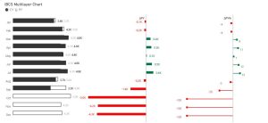
In many IBCS-style reports, one of the most common patterns is comparing the current period with a reference point, usually the previous year or a planned value. Instead of just showing a single number, the focus is on context. You typically see the actual value, the reference value, and the difference between them, both in absolute terms and as a percentage. This delta is often the most important part of the chart because it immediately shows whether performance is improving or declining and by how much. The idea is not just to display numbers side by side, but to make the deviation visually obvious so that users can instantly understand what has changed and whether it requires attention.
What problem it solves in practice
In real companies, the biggest issue with reporting is not lack of data. It is inconsistency in interpretation.
Two reports can show the same numbers but lead to completely different conclusions because they are presented differently.
IBCS reduces this risk by enforcing a shared visual language.
When applied properly, it helps users:
- Compare performance across time and departments easily
- Identify deviations without mental effort
- Understand whether something is good or bad instantly
- Focus on decisions instead of decoding visuals
In other words, it removes the “thinking about the chart” step and leaves only the “thinking about the business” step.
Learning and building IBCS charts in practice
If you want to actually build IBCS-style charts, there are several practical ways to learn and implement them depending on your level and tools.
A very good starting point is a tutorial by Injae Park on YouTube, where IBCS principles are explained in a practical, hands-on way. It helps you understand not just the theory, but how to structure charts in real scenarios.
For more advanced implementations, many developers also use SVG-based approaches. One useful resource is the UDF (Universal Design Framework) library by Marco Russo and Alberto Ferrari, where reusable patterns and advanced calculation logic can help you build more standardized and consistent visuals.
Another very flexible option is Deneb in Power BI, which allows you to build fully custom visuals using Vega or Vega-Lite. This is often where IBCS principles can be applied most precisely, because you are not limited by default Power BI visuals.
Each of these approaches has its strengths. Some are faster to implement, some are more flexible, and some are closer to pure IBCS compliance. The right choice depends on your level of control, your project constraints, and how deeply you want to standardize your reporting.
Real value for the audience
The real value of IBCS is not in making charts look professional.
It is in reducing cognitive load.
When a manager opens a report, they should not ask:
“What am I looking at?”
They should immediately understand:
“What is happening, why it matters, and what requires attention.”
This is especially important in environments where decisions need to be made quickly and repeatedly.
IBCS supports this by making reports predictable. Once users learn the visual language, every new report becomes easier to understand.
That consistency builds trust, and trust is what makes data actually used in decision-making.